Tuesday, November 29, 2016

Floral Decorators, Rubbermaid, April 1973


At some point during the mid-20th century, the household bathroom began to change from a mostly utilitarian space to a room worthy of extensive decorator touches. Gone were the days of  a room with stark white toilets and sinks, with plain towel rods and cold linoleum on the floor, and in its place emerged a space in which no detail was too small to become part of the decor. Color and pattern began filling nearly every inch, from bath tissue boxes to wastebaskets to coordinated toilet tissue rolls to borders on towels and washcloths. A product such as Rubbermaid's Floral Decorators would fit nicely into this scheme.

Floral Decorators were rubber panels which were available in a raised antique cane or floral design, and in a variety of decorator colors. The panels came with self-adhesive strips which could be attached to any hard surface. The ovals were primarily intended for the top of toilet seat lids, and the rectangles for the doors of medicine chests and vanities and the top of the tank lid, although the panels could be used on the wall or other spaces or rooms as the decorator wished.

At a time when many elements of bathroom decor featured fabrics and materials that were notoriously difficult to keep clean, Floral Decorators actually made a lot of sense. They were a way to add a pop of color to the toilet without resorting to the fuzzy carpeted seat and tank covers that were attractive but somewhat unsanitary; the panels could simply be wiped clean with a damp cloth. And, if the decorator wished to change the color scheme, the panels could be simply peeled off.

Some decorating trends of the 1970s seem a bit over-the-top in retrospect, but this one seems to be less so than many. After all, even a practical room such as the bathroom deserves a little color and decorator love.

Tuesday, November 22, 2016

Instant Breakfast, Carnation, August 1966


Prior to 1966, the leisurely breakfast was an important part of the routine of many households. But as more women began entering the workforce, suburban and rural workers faced longer commutes to work, and children became involved in more activities, the preparation of traditional breakfast fare such as bacon and eggs or even cereal seemed too time-consuming for many. The dilemma arose as to how to create a breakfast product that would be extremely quick to prepare and consume, yet still provide the same amount of nutrition as a meal would. Carnation rose to this challenge with its Instant Breakfast.

Instant Breakfast had first been developed by Carnation in 1964, but was available only to consumers in a small number of test markets until early 1966, when it became more widely distributed. Each package of Instant Breakfast consisted of six pouches of flavored mix which could be stirred into a glass of milk. Each prepared Instant Breakfast was touted to provide the equivalent amount of protein, vitamins and minerals as a traditional breakfast with eggs, bacon, buttered toast and orange juice. The product came in a variety of flavors, including Chocolate Malt, Vanilla, Strawberry and the best-selling Chocolate. My favorite, however, was the Eggnog flavor, which was especially delicious and tasted very much like the real thing rather than just a powdered imitation.

Instant Breakfast has been an enduring product over the last 50 years, as it is still available in supermarkets and online, and in several flavors (although, unfortunately, not Eggnog). It seems that consumers are still very much in search of the quick yet nourishing breakfast that Instant Breakfast provides.

Friday, November 18, 2016

Diet 7-Up, The Seven-Up Company, July 1981


The use of celebrities has long been an effective means to promote a product both in TV and radio commercials and in print media. It's not unreasonable to assume that if consumers see a celebrity they admire touting the virtues of a product or service, they will be more likely to try it themselves. Another successful technique often used by advertisers is introducing humor in ads in an attempt to entertain consumers and associate positive emotions with the product. This 7-Up ad, one of several used during the years 1979 to 1981 featuring Lynda Carter and Don Rickles, utilized both of these methods.

At the time this ad was published, Lynda had wrapped up a successful run as the star of the TV series Wonder Woman just two years prior and had appeared in several movies. Don Rickles had made appearances in numerous TV series and movies, and was well known for his pointed and sometimes insulting humor. The 7-Up ad campaign paired the two of them in various environments, trading good-natured barbs over the diet drink. One of Lynda's catchphrases was that it "did not have the funny diet taste," referring to the aftertaste from saccharin, the most commonly used sweetener for diet sodas at that time. Although Diet 7-Up did contain a sugar substitute, the lemon-lime flavor masked the chemical aftertaste more successfully than was the case with the diet colas of the day.

Diet 7 Up has undergone quite a few changes since 1981; it is now sweetened with aspartame rather than saccharin, and is available in a cherry-flavored version in addition to the original. It would have been interesting to have Lynda and Don reunited in a newer campaign, poking good-natured fun at each other over a glass of Diet Cherry 7-Up. The result would likely have been just as entertaining and successful as it was in 1979-81.

Tuesday, November 15, 2016

The New Book of Knowledge, Grolier Incorporated, November 1968


Those of us of a certain age may remember the encyclopedia salesperson, who went door-to-door in many neighborhoods in search of families who wanted to enrich their children's educations through purchasing encyclopedias and related reference books. Such books were available for use in libraries of course, but the salesperson emphasized the convenience of having the books instantly available at home whenever a child needed to utilize them for a school assignment or just for leisure reading and exploration.There were several prominent encyclopedia sets available during the late 1960s and 1970s, including the Encyclopaedia Brittanica and the World Book Encyclopedia. Also available was The New Book of Knowledge, the encyclopedia intended specifically for children.

Most encyclopedias of the era were written at one reading level for all the topics covered in them. The New Book of Knowledge's approach was a bit different in that it tailored the reading level of the topic to the grade in which a child was most likely to study that subject. For instance, an article on basic addition and subtraction would be written at around a first grade level, while an article on photosynthesis would likely feature the language and syntax of the upper elementary grades. The goal was to make sure a child could easily understand the subjects presented, but also to provide more challenging reading material in more advanced subjects...an encyclopedia which could "grow" with the child's needs. To keep the material up-to-date, Grolier published a supplemental volume each year of various timely topics and new developments.

Advances in technology have made the door-to-door encyclopedia salesperson a relic of the past, and even hardbound encyclopedia sets such as The New Book of Knowledge themselves are fairly scarce nowadays except in schools and libraries. But years ago, long before there was an internet, they were an essential part of childrens' research projects and a window into unexplored worlds. They were the "Google" for us Baby Boomer and Generation X kids.

Friday, November 11, 2016

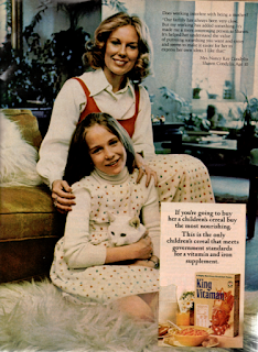
King Vitaman Cereal, Quaker Oats Company, August 1974


In 1974, there was no shortage of cereals available in the typical North American supermarket. Dozens of varieties filled the shelves, from corn to wheat to rice, flakes to O's to shapes, sweetened or unsweetened, and flavors from strawberry to chocolate to blueberry and everything in between. There were even varieties that were specially formulated to meet most if not all of an individual's daily requirements for many vitamins and minerals, and one of those was King Vitaman.

King Vitaman had been introduced in 1968 as a healthier alternative to the higher-sugar cereal brands commonly favored by children. In addition to its somewhat lower sugar content, each serving provided 100% of the recommended daily allowance for the key vitamins and iron. However, being a children's cereal, something more than just good nutritional content was needed to appeal to youngsters. The cereal itself consisted of a corn and oat base in the shape of little crowns with holes in the center, and the image of a smiling King Vitaman was imprinted across the front of each box. There were even a series of commercials featuring a cartoon-style King Vitaman and his pals in a variety of adventures and misadventures, and a prize such as a miniature racing car or a mask was frequently included in each box.

The animated commercials, prizes, and the interesting shape of the cereal would have appealed most to kids such as 10-year-old Shawn Condylis pictured with her cat in this ad. But for her mother, Nancy, it was the nutritional content that was most important, and the assurance that Shawn would able to enjoy a nutritious breakfast even while having a mother who worked outside the home. That concept seems very commonplace today, but in 1974, with fewer women (and particularly mothers of young children) in the workforce, it was a bit less of the norm.

42 years after the publication of this ad, King Vitaman is still available in some markets. Perhaps it is even a favorite of Shawn's children or grandchildren.

Tuesday, November 8, 2016

Disc Cameras, Eastman Kodak Company, October 1982


The Eastman Kodak Company had long been at the forefront of new developments in pocket camera technology. Over the years, the company had introduced camera models with various unique and useful features, including built-in flash capabilities and instant print film. In 1982, the company decided to create an entirely different style of pocket camera, the Disc.

As the ad stated, the Disc had a built-in flash with an extremely rapid flash rate, a feature that was quite unusual among pocket camera models of the day. It also boasted an automatic advance function which eliminated the need to manually advance the film after each exposure. The most prominent innovation, however, was the shape and structure of the film itself. Rather than a roll of film encased in a plastic cartridge, the Disc camera's film pack consisted a flat rotating disc with a capacity of 15 exposures. Because the disc was so thin, it allowed Kodak to design a camera body that was slimmer and more compact than its traditional pocket cousins such as the Instamatic.

A slender pocket camera with many automatic features seemed like a good idea in theory, and many consumers agreed, as more than 25 million Disc cameras were sold between 1982 and 1988. But for all the nifty features, the Disc suffered from one major and fundamental flaw: picture quality. Because the area for the negative was confined to a tiny rectangle on the edge of the disc rather than the larger space of traditional film rolls and cartridges, the resolution of the photos was limited, and photos often appeared grainy and blurred when developed from the discs, especially if they were enlarged. Additionally, many photo finishers did not have the necessary equipment required to process the Disc negatives, so this resulted in longer waits for the finished prints. These drawbacks, plus the growing popularity of lower-priced 35mm models, eventually caused the public to lose interest in the Disc cameras, and Eastman Kodak ceased production of them in early 1988. Film discs continued to be manufactured until December 1999, and nearly 17 years later, only a few photo developers still process Disc film.

It's interesting that digital and smartphone cameras have become smaller and smaller, all without sacrificing picture quality or features. With analog cameras such as the Disc, unfortunately, miniaturization came at a price.

Friday, November 4, 2016

Esso Service Stations, Humble Oil and Refining Company, September 1963


There are certain advertisements that seem especially evocative of the era in which they were created, and this one is a perfect example of that. So many elements of this Esso ad are reflective of a lost era, when even a stop at a service station could be a fun and memorable experience.

In the 1960s, as construction of the United States interstate system was well underway, many families took extended road trips as a part of their vacations. And for these trips, the full-service gas station was a key part of the experience. Not only could motorists have their tanks filled by the station attendant (a service that is rare in much of North America today except for New Jersey and Oregon), but could also have their oil and fluids checked and their windshields cleaned. There were also maps available for the taking, with guidance as to the best routes to take for a particular destination (this was *long*before the days of GPS!) And of course, as most road travellers would have agreed in 1963 (as well as today), clean restrooms were a must. At a time when facilities at service stations could be very hit or miss, Esso/Humble  prided itself on its sparkling restrooms (and even promoted them with prominent signage indicating just that).

In this ad we see a typical family of the time with two children, enjoying a drive through Wawona in their bright yellow sedan and peering down from the crown of the State of Liberty. We see Mom and Sister marvelling at the clean restroom paper towels (a contrast from the often-grimy rotating cloth towel-on-a-roll dispensers commonly used in public restrooms at that time). We also see Son enjoying a soft drink (in a glass returnable bottle!) while Mom and Sister wait for the attendant to finish cleaning the car's windshield (Dad is presumably inside the station getting maps).

Much has changed since 1963, as even the Esso brand itself was changed to Exxon in the United States  in 1973 (although the Esso name is still used in Canada). The smiling attendant and the Happy Motoring! signs are now long gone from most Exxon stations throughout the country. But the road trip continues to be a popular travel experience, and for many people, the memories remain of a simpler, and perhaps more enjoyable era.

Tuesday, November 1, 2016

Monster Vitamins, Bristol-Myers, February 1975


Getting children to take medicines, including vitamins, has always been a challenge for parents and caregivers, and that was particularly true for the earlier part of the 20th century, when most pills were decidedly unappealing. But that challenge was made a lot easier with the introduction of children's multivitamins in interesting and fun shapes and colors, and in fruit flavors. There were several varieties of children's vitamins introduced during the 1960s and 1970s, including Flintstones, Pals, and the subject of this blog, Monster Vitamins.

Monster Vitamins featured seven different monster characters, including the pink Screaming Mimi with cone-shaped hair, the purple Blob, the orange Fedorable with its giant hat, and the two-headed red Sneaky and Squeaky.  Though the characters appeared friendly enough, they were, after all, still monsters...so a spooky ad for the product seemed called for. And in the 1970s, if you wanted spooky, there was no better person than Vincent Price.

Vincent was well-known for his work in horror films, as well as guest appearances on sitcoms such as The Brady Bunch. His distinctive sinister voice and quietly menacing persona made him the perfect choice for television commercials promoting products with a scary or haunted theme, such as the Milton Bradley game Stay Alive and Vincent's own Shrunken Head Apple Sculpture Kit. His appearance in this ad (and the accompanying 1974 TV commercial) gave just the right amount of  fun scare factor to interest kids (and their parents) into getting acquainted with the monster gang and taking the vitamins.

Although Monster Vitamins were a fairly short-lived phenomenon - Bristol-Myers ended production of them in the late 1970s - the characters, and Vincent's ads promoting them, are likely a fond memory for many '70s kids.

Friday, October 28, 2016

Columbia House Record and Tape Club, January 1983


The early '80s were a time of many greats...great movies, great TV shows, and of course great music. For the music collector, keeping up with all the new releases was an ambitious goal. Getting 11 (or more) albums for just one penny seemed to be an optimal way to fill in holes in the collection and sample the music of new artists, and that's precisely what Columbia House Record and Tape Club promised to deliver.

Columbia House had its beginnings in the 1950s as the Columbia Record Club, the first of several such clubs to sell record albums by mail order directly to the public. As other formats such as 8-track and cassette became more popular, the club was rebranded as Columbia House in the early 1970s and exponentially expanded its membership base throughout that decade. 

Much of the reason for this growth was the enticing ads such as the one pictured here. For just one cent, plus shipping and handling fees, a member could receive 11 albums (or 12 if he/she remembered to fill in the bonus gold box). In return, the member was expected to purchase 9 more albums at regular Club prices, plus shipping and handling, over a 3-year period. As an incentive, every few weeks the Club mailed out its music magazine which contained a description of the "Selection of the Month" for the music category the member was interested in. Usually this was a newer release by a fairly well known, although not necessarily A-list, artist. The Club would automatically mail the Selection of the Month unless the member returned a card declining it.

All in all, the Club was not a terrible deal, although the terms seemed a bit less appealing after the initial shipment was received than they had in the beginning. For one, the regular Club prices for the 9 additional purchases required ranged from $7.98 to $9.98, which was a bit on the high side for most music releases in 1983. Additionally, there was a shipping charge assessed for each album, which at the time was approximately $2. This made the additional purchases about $10 per album. Finally, there was the matter of regularly having to remember to mail in the card declining the Selection of the Month, or else getting stuck with an album the member didn't necessarily want (and at a somewhat premium price at that)!

From personal experience, I can say that the Club operated reasonably fairly, and while in actuality there wasn't such a thing as "free" albums once the shipping and other costs were factored in, it was not necessarily a rip-off either. When the costs for the initial "free" albums, the 9 purchases at regular price and the shipping fees were averaged out, the result was close to what the albums would have cost at retail.

So, while there wasn't an immense saving in the long-term, it was admittedly fun to open that first shipment and see all the newly acquired titles. Now and Forever, anyone?

Tuesday, October 25, 2016

Frigidaire Refrigerators, General Motors, December 1962


This ad depicted the typical fashionable American family of the early 1960s...Dad in dark suit and horn-rimmed glasses; Mom in a classic red dress with a coordinating headband over her flipped hairdo; Son in jacket and short pants with knee socks and Daughter in short smocked dress with ankle socks and Mary Janes. The real fashion plate of the family, however, at least as implied by the ad, was the 1963 Frigidaire refrigerator in the center.

By 1962, most households had traded in their ice boxes for refrigerators of various makes and models, and of those, Frigidaire was one of the best known and highly regarded. That wasn't too surprising, as it had been Frigidaire who had manufactured the first electric self-contained refrigerator in 1918 and who had been at the forefront of developments in the industry since that time. This 1963 model contained quite a few advanced features such as the built-in ice cube bin (a contrast to the metal trays with handles commonly used at the time) and the Frost-Proof mode which did away with the messy and time-consuming process of manual defrosting. The model pictured here had the freezer section on the bottom, a design which is not commonly seen today but which in some ways is actually more practical than the more widely utilized freezer-on-top models. The 1963 Frigidaire came in several decorator colors, including the mint-green shade depicted in this ad.

While it may have been a bit over-the-top in retrospect to describe the Frigidaire as "fashion-fresh," there's nothing wrong with wanting to design an appliance that is nice-looking as well as functional. And, it appears, the 1963 Frigidaire succeeded well on both counts.

Friday, October 21, 2016

Miracle White Super Cleaner, Drackett Products Company, June 1977


Striking a correct balance between product effectiveness and environmental protection has long been a challenge for manufacturers of certain types of items. This was particularly true in the case of laundry detergents. The detergents of the 1950s and 1960s had generally contained high amounts of trisodium phosphate, a water softener which enabled the detergent to clean more effectively. Unfortunately, studies performed in the early '70s showed that phosphate additives in city wastewater had increased exponentially and were having adverse effects on plants and aquatic animals. As a result, detergent manufacturers began reducing the amount of phosphates used in their formulas, but this often resulted in dingy laundry due to the lowered effectiveness of the cleaning agents. A solution was needed to boost the lower-phosphate detergents' performance, and it came in the form of products like Miracle White Super Cleaner.

Miracle White had been developed in the late 1950s, so it was not a new product. However, after Drackett Products acquired Miracle White from previous manufacturer Beatrice in early 1977, they seized upon the trend toward lower phosphates in detergents as a ripe opportunity to reintroduce the product to the public. And, how better to promote a household cleaning agent than by utilizing the image of one of the most beloved television housekeepers, Ann B. Davis?

When this ad was published in the late spring of 1977, Ann had just wrapped up a handful of appearances on The Brady Bunch Hour as Alice, the housekeeper character she had portrayed on The Brady Bunch from 1969-74. Interestingly, this ad (and other Miracle White ads from the period) does not mention her role as Alice, but rather depicts her as Schultzie, the owner of a fictitious laundromat. Schultzy (slightly different spelling) had been the nickname of Ann's character on an earlier TV series, The Bob Cummings Show, although Schultzy's occupation was that of a secretary rather than a housekeeper. Perhaps licensing issues prevented more direct and accurate references to Ann's previous TV roles, but there seems to be no doubt that Miracle White wanted to connect its product with Ann in the eyes of the consumer public, however indirectly. 

Ann was not the only Brady Bunch cast member to be closely associated with a product during the mid-to-late 1970s. But that's a blog for another day. ;-) 

Thursday, October 20, 2016

Pick-A-Mix, Brach's, May 1987


For many youngsters (and for many adults, for that matter), going to the grocery store was not exactly the most interesting of experiences. After all, it's hard to get enthusiastic over aisles of canned beans, frozen vegetables, and bathroom cleaners. But there was one section of the supermarket that many people, young and old, viewed more enthusiastically, and that was the Brach's Pick-A-Mix display.

Brach's introduced its Pick-A-Mix in 1958, borrowing the concept from the penny candy sections of drugstores and the candy barrels of the general stores of old. Customers could select their own mix of candies and bag them, and the price would be based on the weight of the bag, not the individual candies. Brach's had quite a few varieties to choose from, including Jelly Nougats, Starlight Mints, Butterscotch Disks, Starlight Mints, Neapolitan Coconut Squares, Royals in various flavors like Orange, Vanilla and Maple, Perkys (jelly candy squares covered in colored sugar), and Caramel Creams (sometimes called "Bulls-eyes" or "Bullies" for short). With Pick-A-Mix, each family member could select the varieties of candy they liked best, whether it be an entire bag of one kind of candy, evenly split among all the varieties available, or something in between.

As a child, my favorites were the Neapolitan Squares and the Royals, with the Caramel Creams not far behind. For some reason, I did not like the Jelly Nougats, although they did grow on me more with time.

Brach's Pick-A-Mix displays can still be found in some supermarkets. Some of the varieties of candy in them are the same ones offered many years ago, while others are new additions. It's interesting that a concept launched almost 60 years ago is still going strong today. But then again, most everyone loves candy!

Wednesday, October 19, 2016

Swanson TV Dinners, Campbell's Soup Company, March 1966


Up until the early 1950s, dinners were almost exclusively served in the kitchen or at the dining room table. The growing popularity of television began to change all that as families looked for a way to enjoy dinner while viewing their favorite programs. The TV dinner, first produced by Swanson in 1953, seemed to be the ideal solution. Rather than slaving over a hot stove, the family cook could remove the dinners from the freezer, pop them into the oven, and approximately 30 minutes they would be piping hot and ready to eat. The foil trays were perfect for serving, especially in front of the TV, and afterward there would be very few dirty dishes to clean up.

At first, TV dinners came in limited varieties, such as turkey and dressing, Salisbury steak, and fried chicken as pictured in this ad. This would later expand to more choices such as meatloaf and beef & gravy with a variety of sides and even desserts. Lest there be any doubts about the quality of the meat used in the frozen dinners, Swanson sought to assure consumers that its chicken and other meats were only of the finest grade, the same quality that the family cook would choose for a home-cooked meal.

As someone who grew up primarily in the '70s, I always loved Swanson TV dinners. Even though my mother is and was an excellent cook, there was something oddly fun about eating dinner from the foil tray in front of the TV. Of course, TV dinners, or frozen microwave meals as they are now known, are still readily available, and in more varieties than would have been imagined in 1966 and even quite a few years beyond that. But those were simpler times, when something as ordinary as a frozen dinner could make for a special occasion.

Tuesday, October 18, 2016

SuperCab Pickup Trucks, Ford Motor Company, July 1974


Pickup trucks are extremely popular vehicle style today, and that was true in the 1970s as well. One drawback with the pickups of the day, however, was the limited seating and interior storage capacity of traditional cab models. Some families found a workaround by allowing the children to ride in the truck's bed, but that was somewhat unsafe and quite impractical in cold and/or rainy weather conditions. The solution seemed to be to design a pickup that would be able to comfortably seat an entire family in the cab, and the Ford Motor Company did just that with its new SuperCab model.

The SuperCab had front and rear bench seats which accommodated up to six people, and offered several interesting options, including a folding foam rear seat and two jump seats on either side of the rear cab. These options gave the owner almost as much interior passenger and cargo space as a traditional sedan. For some reason, though, the SuperCab and other extended-cab pickup truck models were a relatively uncommon sight on the roads during the 1970s, especially compared to traditional cabs. Perhaps the design just needed a few more years to resonate with the public, as the extended cabs became much more common during the 1980s and beyond.

This ad is so quintessentially '70s...the mop-headed boy in the Cincinnati Bengals jacket (NFL jackets were extremely popular among grade school-aged youth back then), the avocado and burnt orange hard-sided luggage, the sunny gold color of the truck itself. Yet the design concept seems years ahead of its time, and just as useful today as it was back then.

Monday, October 17, 2016

Tab, The Coca-Cola Company, November 1985


For quite a few years after its introduction in 1963, Tab had been one of the top sellers in the diet soda market. That started to change in the early 1980s when several other diet colas, including Coca-Cola's own Diet Coke, began to outpace the sales of Tab. Part of this may have been due to the fact that Tab contained only saccharin, which unfortunately had something of a chemical aftertaste, while Diet Coke was sweetened with a blend of saccharin and the newer aspartame, which was said to more closely resemble the taste of sugar. In any event, Coca-Cola ran several campaigns to rekindle interest in Tab, and gave the product a catchy new slogan, "Tab's got sass."

The '80s were all about sass, which fit well with the slogan, and they were also all about activewear, thanks to the popularity of the fitness movement as well as films such as Flashdance which prominently featured the female lead in a sweatshirt. So, a promotion offering sweatshirts, t-shirts and sweatpants seemed like a natural fit. Consumers could send in a receipt noting the purchase of Tab, plus funds to cover the cost of the items, and they would receive colorful activewear at a reasonable cost. In turn, Coca-Cola would receive the proceeds from the soda purchase required for the offer, as well as some willing free advertising from wearers of the shirts with "Tab's got sass" boldly emblazoned across the front.

It all sounded like a win-win situation, and perhaps it was, but I must say that I don't recall ever seeing anyone wearing any of the Tab-featured clothing items, or come across them in secondhand stores. And, unfortunately for Coca-Cola, sales of Tab continued to decline during the 1980s and beyond as more diet sodas with newer sweeteners became available. Still, you have to give Coca-Cola credit for trying to update the image of Tab in a way that would give consumers a little lasting style.

Sunday, October 16, 2016

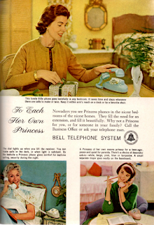
Princess Telephones, Bell Telephone Company, October 1961


By 1961, the telephone had become an important part of the home, with well over half of American households having at least one of them. While consumers may have raved about the technological capabilities of the phone, they were likely a bit less enthused about its appearance. Older phones were bulky squarish tabletop and wall-mounted units in a very limited choice of colors - mostly black - and had a decidedly stodgy, utilitarian look that didn't exactly jibe with the color-coordinated and stylish trends of mid-century decor.

The Princess phone, first introduced in 1959, was one of the earliest attempts to give the telephone a more aesthetically pleasing appearance. The units were more rounded and compact than traditional tabletop phones, and came in a variety of colors in order to coordinate with some of the most commonly used decorator colors of the day. They also had a light in the dial which activated when the receiver was lifted, so that a user would be able to dial a number in the dark without turning on a lamp. Although touch-tone versions would become available just two years after this advertisement was published, these earlier Princess phones had only the rotary-dial option.

The image of a typical teenage girl, chatting on the pink Princess phone in her bedroom, was iconic in various forms of pop culture media throughout the 1960s and 1970s. Princess phones continued to be popular for quite a few years. Although no longer made, used models have become a collectors item for those seeking to recreate the mid-century look, and perhaps to help evoke memories of a more simple era.

Saturday, October 15, 2016

Space Food Sticks, Pillsbury, September 1971


In the early 1970s, interest in outer space exploration was extremely popular. The United States had just successfully landed its first men on the moon, and various other missions were being carried out to further explore the boundaries and wonders of space. Astronaut was the dream career of many young children of that era, and anything even remotely associated with the space program had a good chance of resonating well with the consumer public. This was true of Space Food Sticks, developed in the 1960s and trademarked by Pillsbury in 1970.

The initial goal behind Space Food Sticks was to create a portable, ready-made food containing an optimal balance of protein, carbohydrates and fats, an important aspect for astronauts in environments where food choices, preparation and storage options were extremely limited. A prototype of Space Food Sticks had actually been used in at least one of the missions, and a modified version was used on another. For those firmly on terra firma on Earth, however, they were marketed as a healthier nutritional alternative to candy bars and cookies, and at just 44 calories per stick, Space Food Sticks weren't exactly a diet-buster either.

Space Food Sticks were dropped from supermarket shelves sometime in the 1980s, although for quite a few years they were available at a few larger toy stores and various flight and space-oriented museums such as Kennedy Space Center. Unfortunately, production ended in 2014 and has not resumed as of this date.  Perhaps someday they will return on a larger scale, particularly if interest in exploration to Mars and other planets continues to grow. For now, though, they are a nice reminder of the golden age of space travel.

Friday, October 14, 2016

Breeze Detergent, Lever Brothers, February 1966


One effective way to promote a product is to give the consumer an added freebie with the purchase. By 1966, this had been done with a variety of products, especially those appealing to children such as the various toys in breakfast cereals and, of course, the prize included in boxes of Cracker Jacks. A more utilitarian product like laundry detergent, however, necessitated a very creative spin on this concept, and Breeze detergent was a notable example.

Breeze detergent was an established product, having been introduced by Lever Brothers in 1947. But beginning in the 1950s, as new brands made the laundry soap market more competitive, Lever used a very unique approach to make Breeze stand out: it included a free towel in every box of detergent. The towels were manufactured by Cannon, a respected brand in the linen industry, and ranged in size from face cloths in the smaller boxes to full-sized bath towels in the king-sized cartons. The patterns on the towels varied over the years, from florals to the Hawaiian stripe featured in this ad. It was a great way for a homemaker to add to the household's towel supply without extra expense, as laundry detergent needed to be purchased anyway.

Although not widely available in North America, Breeze detergent is still being sold in some parts of the world. Unfortunately, the liquid version of today doesn't lend itself very well to the inclusion of a freebie. But in the 1950s and 1960s, the idea worked brilliantly, and doubtless helped stock the linen closets of many households.

Thursday, October 13, 2016

Hydrox Doubles Cookies, Sunshine, July 1986


For over 70 years prior to the publication of this ad, Hydrox and Oreo had been rivals in the cookie market. For many years, both brands concentrated solely on their classic chocolate sandwich varieties, but beginning in the 1970s, the makers tried to distinguish their brand from the other by introducing new spins on the classic formula. In 1974, Oreo introduced the Double Stuf version, which contained twice as much white creme filling as the original variety. Hydrox eventually responded with its own creation, Hydrox Doubles, which were introduced in April 1986.

Hydrox Doubles not only boasted more creme filling than the original variety, but also featured a dollop of flavored creme filling in the center. The flavors were Tasty Mint, Delicious Strawberry, and Rich Chocolate. 

I was unable to find any information about when this cookie was discontinued, but it appears to have been relatively short-lived. It certainly was an interesting idea, but perhaps the buying public thought they weren't quite as "incredouble" as Hydrox's parent company, Sunshine, did.

Anyone ever try these? The mint flavor sounds as though it would have been especially good.

Wednesday, October 12, 2016

Bounty Paper Towels, Procter & Gamble, May 1979


Some products, such as snack and dessert items, lend themselves especially well to advertising campaigns because of the near-universal inherent desirability of the products - after all, who doesn't like ice cream or potato chips? With a more utilitarian product such as paper towels, however, it is a bit more of a challenge for advertisers to find a way appeal to the public and create advertising that distinguishes their brand from others. Procter & Gamble succeeded quite well on both counts with its print and TV ads for Bounty paper towels.

Since its introduction in 1965, one of the strengths of the Bounty brand had always been its ability to absorb relatively large amounts of liquid compared to the size of the paper towel. In order to demonstrate this quality, a series of ads were created featuring actress Nancy Walker as Rosie, the owner/server of a diner (the diner used for as the setting for the ads was an actual establishment, Rosie's Farmland Diner, in Little Ferry, New Jersey).  In these ads, while interacting with Rosie a patron would inevitably topple over a drinking vessel on the counter, usually a coffee cup, and gasp as the liquid puddled. Rosie would calmly take charge, pulling out a roll of Bounty paper towels and praising their ability to clean up the spill in no time flat. She would even give the clumsy patron a demonstration on Bounty's speed of absorbing spills as compared to a competing brand. In these ads, Rosie initially touted Bounty with the catchphrase of "the quick picker upper," but which had become "the quicker picker upper" by the time of this ad in 1979.

Nancy Walker continued to appear as Rosie in Bounty ads until just shortly before her passing in 1992. To this day, Procter & Gamble still promotes the degree and speed of absorption of its paper towels in its print and TV advertisements. For those of us who lived through the '70s and '80s, however, the mention of Bounty paper towels will often bring Rosie and her diner to mind.


Tuesday, October 11, 2016

Stir 'n Frost Cake Mix, Betty Crocker, March 1980


Cakes have been a popular dessert for many years, whether for birthdays, other special occasions, or everyday. Years ago, preparing a cake from scratch, despite being a quite labor-intensive process, was the norm. Then came packaged cake mixes and canned frosting, which considerably trimmed the preparation time but still resulted in a batter-covered mixing bowl and beaters and a dirty cake pan to wash once the cake was finished. As schedules became increasingly hectic, however, even this seemed a bit much for busy cooks at times. Stir 'n Frost, first introduced in 1975, seemed to be a good answer to these dilemmas.

Stir 'n Frost involved very little preparation - just empty the pouch of dry cake mix into the foil-coated cardboard cake pan provided, mix with water, stir, bake and top with the pouch of ready-made frosting. When all the cake was eaten, just throw the pan away. No mess, no fuss, and very convenient. An added plus was that the pans were relatively small, just enough for dessert for a typical family, so there was little waste as compared to the remainder of a full-sized cake drying out when it couldn't be eaten all at once.

One might be tempted to assume that because of its simple preparation, a Stir 'n Frost cake would be inferior to a traditional cake, but that was not the case. Stir 'n Frost cakes were very tasty and moist, and came in a variety of cake and frosting flavors, including chocolate, lemon and spice. Although they were quite popular, Betty Crocker discontinued production of the mixes some years ago and to date has not reintroduced them.

While there are similar quick-preparation cake mixes available today, for many of us who grew up in the '70s and '80s, nothing is quite the same as Stir 'n Frost.

Monday, October 10, 2016

Sylvania Blue Dot Flashcubes, General Telephone & Electronics, November 1965


Digital cameras and smartphones of recent years have made hobbyist photography virtually effortless, with everything from the exposure, zoom and lighting being automatically controlled. That was not the case prior to the mid 1960s, when each aspect of photo-taking involved often cumbersome manual adjustments. One of those adjustments was changing the flashbulb, which provided optimum lighting of the subject by dispersing the light from the bulb via a reflector placed around it. The earliest flashbulbs were intended for one use only, and needed to be changed between exposures. They also got quite hot, due to the gases in the bulb being burned during the flash. These qualities weren't very conducive to taking multiple photos in a short period of time, such as in capturing sports action, and were somewhat cumbersome even for photographing more stationary subjects.

Enter the Sylvania Blue Dot Flashcube, made by GTE. In contrast to the single exposure of traditional flashbulbs, the Flashcube contained four miniature bulbs and reflectors within a small cube that automatically rotated to an unused side in approximately one second after a photo was taken. Compared to the burst mode of today's digital cameras, that's not particularly impressive, but at the time it was a huge improvement over the old technology. The Flashcubes had the added perk of not getting as hot after use as the single-use flashbulbs did, so no more burned hands for the photographer.

I remember Flashcubes well. My parents had a Kodak Instamatic 124 when I was a kid, and for all but the sunniest outdoor shots, the Flashcube would be swiveling around on top of the camera. It was a bit of a pain to have to buy the Flashcubes along with the film cartridges (and $1.95 suggested retail for three cubes was the equivalent of nearly $15 in today's currency, so they were not exactly inexpensive), and there were the occasional duds in which one or more of the sides wouldn't flash, resulting in underexposed prints. In general, however the technology worked reasonably well. Gradually more and more cameras began including a built-in flash, eventually rendering the Flashcube mostly obsolete. But in 1965, and for quite a few years after that, the Flashcube shone brightly.

Sunday, October 9, 2016

Cup-A-Soup, Lipton, December 1972


Prior to the early 1970s, preparing a cup of soup was not exactly an instant affair. The quickest method available at that time was heating up canned soup (which most people did in a saucepan on the stovetop, as microwave ovens, while available, were not widely in use then). Additionally, for light eaters there was the dilemma of how to prepare an individual serving of soup without wasting the remainder in the can. The introduction of Lipton's Cup-A-Soup line of products in 1972 seemed to be the answer to both of these issues.

Cup-A-Soup's selling point was definitely the convenience factor...no pan to wash, no waste - just empty an envelope of dry mix into a mug or small bowl, add boiling water from a kettle, and voilà - hot soup! This was a perfect solution for those who wanted a quick, light meal or snack without all the mess and fuss.

Of the five varieties of Cup-A-Soup that were first introduced, the two I recall trying were the Chicken Noodle and the Beef Flavor Noodle. Both were good, although a bit on the salty side (but what soup isn't?). My favorite, though, was Ring Noodle, which became available a bit later on (and is still available today).

It's interesting to think that 40-plus years ago, something as ordinary as instant soup was a revolutionary concept. But that is part of the fun of looking at these vintage ads...everything old was new once!

Saturday, October 8, 2016

Burger King Salad Bar and Pita Pockets, Burger King Corporation/Pillsbury, August 1983


Despite its massive successes in the latter half of the 20th century, the fast-food industry had always been viewed as offering a less-healthy alternative to home-cooked meals. The increasing public emphasis on diet, healthy eating, and fitness during the 1970s and early 1980s prompted some fast-food chains to begin offering healthier, lower-fat items to their menus alongside the traditional burgers, fries, and soft drinks. Burger King jumped onboard the healthy choices train with the introduction of salad bars in 1983.

Burger King's approach was unique in that it not only offered a traditional salad on a platter, but also a pita bread pocket into which vegetables, cheese and dressing could be placed. This was an interesting concept, as it enabled the creation of a convenient "salad sandwich" for those eating on the go.

While this idea sounded good in theory, the reality was a bit less successful. I remember trying the salad bar on several occasions back in the day, both as a platter and in the pita pocket. The pita pockets were not particularly large, and it was difficult to open the pocket enough to place the salad fixings into without tearing the bread. Additionally, the dressing tended to leak all over the outside of the bread unless the pocket was continuously held upright. The salad platter didn't present either of these problems, and was reasonably good, with a decent amount of choices, particularly for a fast-food establishment (at least at the locations I went to). That apparently wasn't enough to woo Burger King customers, however, and the salad bars began being phased out very shortly thereafter due to their high maintenance and low profitability.

Even though the salad bars didn't turn out to be the success that Burger King likely hoped for, you gotta give 'em credit for trying.


Friday, October 7, 2016

Chef Boy-ar-dee Spaghetti & Meatballs, American Home Products, May 1976


Advertisements tend to reflect the socioeconomic times in which they were created. In more prosperous times, the value of a product tends to be less often emphasized as compared to the product's features and desirability. In contrast, when times are leaner, ads tend to promote the budget-friendly aspects of the product. This Chef Boy-ar-dee ad is an interesting example of this phenomenon.

In the spring of 1976, the U.S. was just beginning to emerge from a significant economic recession, although its effects lingered on to some degree throughout the decade. Food prices had spiked, and cutting costs at the supermarket became a concern for many consumers. Since meat comprised a large percentage of the typical grocery budget at that time, meatless meals became more common and meat was viewed as somewhat of a luxury item for the budget-conscious. The ad's mention of a "good, hot family dish with meat" was an effective appeal to those who yearned for the heartier meals served in better economic times.

24 cents per serving was not a lot of money even in 1976, particularly for a main course. However, that cost was calculated on one 40 ounce can yielding five one-cup servings. A one cup serving seems a bit skimpy, particularly for an adult, although it's true that portion sizes in general tended to be smaller at that time than they are today.

Chef Boy-ar-dee pasta and its rival brand, Franco-American, were the saving grace of many a lunch or dinner table in the 1970s. Although my family generally bought the Franco-American brand, I do remember having Chef Boy-ar-dee on occasion and liking it pretty well. After all, what kid doesn't like spaghetti? ;-)


Thursday, October 6, 2016

Orville Redenbacher Microwave Popping Corn, Hunt-Wesson Foods, March 1984


For many years, consumers made popcorn the old-fashioned way...either on the stovetop or in an electric corn popper dedicated to that purpose. The increasing popularity of the microwave oven in the early '80s, however, paved the way for an entirely new popping method and accompanying products. In 1983, several major companies began offering microwavable popcorn varieties, but perhaps none was as well-known as Orville Redenbacher's brand, made by Hunt-Wesson Foods.

Orville Redenbacher was a familiar face to anyone following pop culture in the 1980s, thanks to his regular appearance in TV commercials and print ads. He had been a popcorn grower and businessman since the 1950s, and had done promotional work on behalf of his company's brand in the past, but it was the microwave popcorn advertising campaigns that made him an icon, much like Colonel Harlan Sanders of Kentucky Fried Chicken.

My family didn't own a microwave until about 1986, so I can't vouch for the quality of microwave popcorn in its earliest days, but I can say that the Orville Redenbacher brand has generally been very good. Today, it is available in all sorts of varieties as opposed to just the Natural and Butter flavors that were available in 1983-84. But there's something to be said for the basics.

Wednesday, October 5, 2016

Manhattan Color Stereo Theatre, Magnavox, October 1966


This ad captures a section of the typical living room of exactly 50 years ago, what designers affectionately call the Mid-Century Modern look today. The gold walls and carpeting, matching drapes in a bold pattern, the faux palm tree, the record album resting on the seat of the walnut Danish Modern armchair...these were all elements of the look, but the focal point of this and many other living rooms of the era was the console television or TV/stereo combination, such as the Magnavox Manhattan Color Stereo Theatre pictured here.

In the 1960s and 1970s (and even extending into the '80s), TVs and stereos were often purchased as much for their appearance as furniture as for the quality and features of the electronics housed within. The wood cabinets came in all sorts of models to complement the furniture styles of the era...Early American, Mediterranean and Contemporary were some of the most popular. Sometimes the TV screen would be housed behind doors, or completely open as in the pictured set. The screens were not very large compared to today's standards - this model's screen was 270 square inches, or 18 by 15 inches.

The Quick-On feature was a nice option, as typically TVs of the era would require a warm-up period of a minute or so before the picture would come on. The Automatic Color was also a bit advanced, as most TVs came with manual controls for adjusting the color balance. And although not mentioned in this ad, I'm sure there was the vertical hold control, essential for stopping the vertical roll of images so common with mid-century TVs. This model was not inexpensive, as $795 in 1966 U.S. dollars would be the equivalent of over $5,900 today. But Magnavox was a quality brand, and many of these sets lasted for quite a few years.

Can't you just picture a family gathered around this set, watching "Green Acres" or "Gilligan's Island"?"

Tuesday, October 4, 2016

Total Breakfast Cereal, General Mills, January 1973


The '70s had their share of popular sayings such as "Love means never having to say you're sorry" and "Today is the first day of the rest of your life." General Mills utilized the second of these maxims in this sunny and serene-looking ad promoting its Total line of breakfast cereals.

Total was not a new cereal at the time, having been on the market for a dozen years prior to the publishing of this ad. However, the '70s were a time of increasing emphasis on nutrition and fitness, and a cereal providing 100% of the recommended daily requirements for a number of the most important vitamins and minerals would certainly fit into this focus. No need for taking a daily vitamin supplement; your nutritional needs would be met with your breakfast.

I remember trying the original wheat Total cereal as a kid a few times in the 1970s. It was ok, although the addition of the nutritional supplements, particularly the iron, gave the cereal a bit of a chemical taste. I don't remember ever trying the Corn Total, but I imagine it would have been similar.

Total is still available today in a number of different varieties. Good nutrition spans the generations!

Monday, October 3, 2016

Kodamatic Instant Cameras, Kodak, September 1982


This colorful ad featuring popular magician David Copperfield introduced the Kodamatic 960 and 970L, two of several instant camera models manufactured by Kodak during 1982 and 1983. Although perhaps not as popular as competing brand Polaroid's line of instant cameras, the Kodamatics utilized a somewhat similar technology. These cameras were only available for a few years before being discontinued in 1986.

I have no personal experience with Kodak's instant camera products, but it's interesting that this ad emphasizes the quality of the finished print when taken in low lighting. With older instant cameras, it was notoriously difficult to find the correct exposure relative to the lighting conditions; photos tended to turn out either overexposed or very dark.

David Copperfield was one of many celebrities to do product endorsements during the late 1970s and early 1980s; that particular era seems to feature more celebrity ads than any other.


Sunday, October 2, 2016

Figurines, Pillsbury, March 1975


Figurines were a brand of popular diet bars most popular during the 1970s, although they continued to be available for a number of years afterward. The bars were not particularly large, about the size of the average granola bar, but they were surprisingly filling. As the ad stated, two of the 138-calorie bars were supposed to be the nutritional equivalent of a complete meal. I recall my mom (who didn't need to diet; I think she liked them more for the convenience) took them to work to eat during her lunch break.

I don't recall ever trying the Vanilla or Raspberry flavors. I may have had the Chocolate Caramel variety on an occasion or two, but I mainly remember the regular Chocolate flavor. They were good, not quite as tasty as a candy bar but not at all bad either.

It's unclear exactly when Figurines were discontinued, but I don't recall seeing much advertising for them after the late '70s or perhaps early '80s. By then they may have become more of a niche item.


Welcome!

Hello! Welcome to my blog.

Perhaps more than any other form of media, a product advertisement is a reflection of the era it was created in. Advertising is not necessarily intended to be an enduring art form (although some ads have gone on to achieve iconic status); rather, it is intended to capitalize on the perceived trends and desires of the consumer public at any given time in order to sell a product. Because of this transitory nature, advertisements from the past capture the spirit of their particular time period in a very unique way.

That all sounds very academic, doesn't it? The fact is, advertisements from the past are just plain cool. Over the years, so many products have been introduced by manufacturers and then discontinued and  forgotten, existing only in the memories of those people who used them and in the pages of the publications which advertised them. Other products which still remain available today have undergone quite a few changes over the years, and the ads which promoted them have captured these changes.

I've been collecting vintage magazines for many years now, and one of the main reasons I do so is because of the advertising in them. It's fun to look at '70s ads, with bell bottoms, harvest gold, macramé and fondue pots everywhere, or late '80s ads featuring models with enormous hair and oversized sweaters standing in rooms decorated in mauve and Williamsburg blue. It's also fun to remember long-discontinued products like Doo Dads, Dyna-Mints and Freakies cereal through the ads which captured them in their day.

This blog will feature various product advertisements from the 1960s through the 1980s, as well as a few observations or recollections about the products in them. Hopefully it will be a fun journey down memory lane. Enjoy, and thanks for stopping by!

The Advertising Attic :)